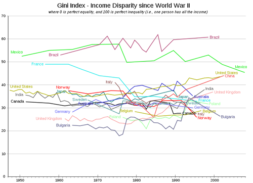
Graph of the week: GINI index for 17 countries since WWII
Leave a reply to Dave Raithel Cancel reply
This site uses Akismet to reduce spam. Learn how your comment data is processed.
Real-World Economics Review
WEA Books

follow this blog on Twitter
Top Posts- last 48 hours
- Cutting-edge macroeconomics …
- The eclipse part wo
- USA: The Great Prosperity / The Great Regression : 5 charts
- Chicago economics — nothing but pseudo-scientific cheating
- Chang's "Edible Economics"
- Economics’ billiard-ball model
- Comments on RWER issue no. 70
- Weekend read - Blood and Oil in the Orient: A 2023 Update
- Weekend read - Enlightenment epistemology and the climate crisis
- Ayn Rand — a perverted psychopath
"We cannot solve our problems with the same thinking we used when we created them." Albert Einstein
Regular Contributors
Real World Economics Review
The RWER is a free open-access journal, but with access to the current issue restricted to its 25,952 subscribers (07/12/16). Subscriptions are free. Over one million full-text copies of RWER papers are downloaded per year.
WEA online conference: Trade Wars after Coronavirus
Comments on recent RWER issues
————– WEA Paperbacks ————– ———– available at low prices ———– ————- on most Amazons ————-
WEA Periodicals
----- World Economics Association ----- founded 2011 – today 13,800 members
Recent Comments
- ghholtham on Basics of Monetary Economies
- ghholtham on Weekend read – Enlightenment epistemology and the climate crisis
- ghholtham on Cutting-edge macroeconomics …
- Jan Milch on The eclipse part wo
- geoffdavies1944 on The eclipse part wo
- Roger C on The eclipse part wo
- David Harold Chester on Chang’s “Edible Economics”
- David Harold Chester on Chicago economics — nothing but pseudo-scientific cheating
- Steven Klees on Chicago economics — nothing but pseudo-scientific cheating
- Steven Klees on Chang’s “Edible Economics”
- Per Kurowski on Chang’s “Edible Economics”
- ghholtham on Chicago economics — nothing but pseudo-scientific cheating
- Edward Ross on The increasing collusion between . . . . . .
- Ikonoclast on Chicago economics — nothing but pseudo-scientific cheating
- metaecongary on Chicago economics — nothing but pseudo-scientific cheating
Comments on issue 74 - repaired
Comments on RWER issues
WEA Online Conferences
—- More WEA Paperbacks —-
———— Armando Ochangco ———-

Shimshon Bichler / Jonathan Nitzan

————— Herman Daly —————-

————— Asad Zaman —————

—————– C. T. Kurien —————

————— Robert Locke —————-

Guidelines for Comments
• This blog is renowned for its high level of comment discussion. These guidelines exist to further that reputation.
• Engage with the arguments of the post and of your fellow discussants.
• Try not to flood discussion threads with only your comments.
• Do not post slight variations of the same comment under multiple posts.
• Show your fellow discussants the same courtesy you would if you were sitting around a table with them.
Most downloaded RWER papers
- The state of China’s economy 2009 (James Angresano)
- The housing bubble and the financial crisis (Dean Baker)
- Global finance in crisis (Jacques Sapir)
- What Is Neoclassical Economics? (Christian Arnsperger and Yanis Varoufakis)
- Green capitalism: the god that failed (Richard Smith)
- Why some countries are poor and some rich: a non-Eurocentric view (Deniz Kellecioglu)
- Debunking the theory of the firm—a chronology (Steve Keen and Russell Standish)
- Trade and inequality: The role of economists (Dean Baker)
- New thinking on poverty (Paul Shaffer)
Family Links
Contact
follow this blog on Twitter
RWER Board of Editors
Nicola Acocella (Italy, University of Rome) Robert Costanza (USA, Portland State University) Wolfgang Drechsler ( Estonia, Tallinn University of Technology) Kevin Gallagher (USA, Boston University) Jo Marie Griesgraber (USA, New Rules for Global Finance Coalition) Bernard Guerrien (France, Université Paris 1 Panthéon-Sorbonne) Michael Hudson (USA, University of Missouri at Kansas City) Frederic S. Lee (USA, University of Missouri at Kansas City) Anne Mayhew (USA, University of Tennessee) Gustavo Marqués (Argentina, Universidad de Buenos Aires) Julie A. Nelson (USA, University of Massachusetts, Boston) Paul Ormerod (UK, Volterra Consulting) Richard Parker (USA, Harvard University) Ann Pettifor (UK, Policy Research in Macroeconomics) Alicia Puyana (Mexico, Latin American School of Social Sciences) Jacques Sapir (France, École des hautes études en sciences socials) Peter Söderbaum (Sweden, School of Sustainable Development of Society and Technology) Peter Radford (USA, The Radford Free Press) David Ruccio (USA, Notre Dame University) Immanuel Wallerstein (USA, Yale University)


The graph is a bit more legible here: http://www.abovetopsecret.com/forum/thread614353/pg1
… about 2/3 down the page. Not sure what to say about the “X-Files” nature of the hosting website…
Why don’t you just pull the data from Luxembourg Income Study. The Canadian plot looks wrong.
So does the Australian plot look wrong.
The data from Norway looks strange. Inequality in Norway has been rising for the last three decades or so. I’m pretty sure the same is the case in Sweden too.
Luxemburg Income Study information can be found on:
http://www.lisproject.org/key-figures/key-figures.htm
The lay out will be horrible, but some of this information is provided below, which does indicate that there are differences between the graph (which however often runs only till about 1995!)and the LIS data. The main conclusions:
A. Anglo-Saxon ineuqality increased much more than inequality in Europe
B. Despite this rise, inequality in latin America and Russia is still much higher than even in the USA (though this last country seems to aquire more and more ‘Latin’ traits)
C. Transition country information is mixed.
Important to note: many transition countries suffered a massive amount of job losses after about 1990 and are only quite recently recovering from this; Gini indices are often only calculated for those people with an income. According to my data, the USA and the U.K. did not do particularly well with regard to jobs or production during the last decades. Total factor productivity seems to have increased somewhat faster in these countries – though this seems not to have been caused by additional productive investment but by laying off labor.
The important question: did inequality rise because of historical developments, or because of policies aimed at increasing inequality? On this, of course: John Schmitt, “Inequality as Policy: The United States Since 1979”, real-world economics review, issue no. 51, 1 December 2009, pp. 2-9, http://www.paecon.net/PAEReview/issue51/Schmitt51.pdf
Gini Coefficient
Australia Austria Belgium Canada Taiwan Denmark Finland
1971 0,316
1972
1973
1974
1975 0,289
1976
1977
1978
1979
1980
1981 0,281 0,284 0,267
1982
1983
1984
1985 0,292 0,227 0,269
1986
1987 0,227 0,283 0,254 0,209
1988 0,232
1989 0,304
1990
1991 0,281 0,271 0,210
1992 0,224 0,236
1993
1994 0,280 0,284
1995 0,308 0,277 0,266 0,277 0,218 0,217
1996
1997 0,266 0,250 0,291 0,287
1998 0,311
1999
2000 0,257 0,279 0,315 0,289 0,225 0,246
2001 0,317
2002
2003 0,312
2004 0,269 0,318 0,228 0,252
2005 0,305
France Germany Hungary Ireland Israel Italy Mexico
1971
1972
1973 0,271
1974
1975
1976
1977
1978 0,264
1979 0,293 0,303
1980
1981 0,288 0,244
1982
1983 0,260
1984 0,298 0,268 0,445
1985
1986 0,308 0,306
1987 0,328 0,332
1988
1989 0,287 0,257 0,303 0,466
1990
1991 0,323 0,290
1992 0,305 0,485
1993 0,339
1994 0,288 0,273 0,283 0,333 0,495
1995 0,336 0,338
1996 0,325 0,477
1997 0,313 0,336
1998 0,346 0,492
1999 0,292
2000 0,278 0,275 0,333 0,491
2001 0,346
2002 0,471
2003
2004 0,278 0,338 0,458
2005 0,289 0,370
Netherl. Poland Russia Spain U.K. USA
1971
1972
1973
1974 0,268 0,318
1975
1976
1977
1978
1979 0,270 0,301
1980 0,318
1981
1982
1983 0,260
1984
1985
1986 0,271 0,303 0,335
1987 0,256
1988
1989
1990 0,303
1991 0,266 0,336 0,338
1992 0,274 0,395
1993
1994 0,257 0,339 0,355
1995 0,318 0,447 0,353 0,344
1996
1997 0,372
1998
1999 0,231 0,289 0,347
2000 0,434 0,336 0,368
2001
2002
2003
2004 0,315 0,345 0,372
The lay out is even more horrible than I expected, please consult the Excel file on the LIS website mentioned above.
The gini on its own is a notoriously fickle measure.
Kind of interesting but one must surely be wary about reading too much into it… I mean, can you really measure the gini coefficient for China accurately? Are we really expected to believe that in Mexicothe gini coefficient is improving steadily, in the middle of the virtual dissolution of the state outside Mexico City and the awful social destruction going on there at the moment?