Home
> upward income redistribution > 1% chart
1% chart
from David Ruccio
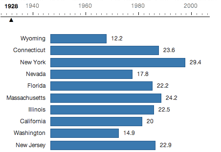
As Niraj Chokshi explains,
In each state in the nation, the top 1 percent of earners saw its share of the income pie grow between 1979 and 2007, according to a new 50-state study of income inequality. The change was starkest in Wyoming, where 9 percent of income belonged to the top 1 percent in 1979. By 2007, that top slice of earners laid claim to 31 percent of all income.
It hasn’t always been the case, though. As the GIF above [shows], the top 1 percent saw its share of all income shrink between 1928 and 1979. Over that half-century, the income pie was shared a little more equally. But since 1979, that trend reversed in every state
Leave a comment


—– look inside —– $5.94 / $20.00

—– look inside —– $4.90 / $8.00

—– look inside —– $15.99

—– look inside —– $5.99 / 12.99

—– look inside —– $5.93 / $12.99

—– look inside —– $4.97 / $9.90

—— Ugarteche, Puyana and Madi ——

Gerson Lima / Maria Alejandra Madi

Edward Fullbrook and Jamie Morgan

————— Michael Hudson ————–

Maria Alejandra Madi / Jack Reardon

————- Edward Fullbrook ————-

—————— Steve Keen —————–

————— Richard Smith —————

————– Gustavo Marques————

– Victor Beker and Beniamino Moro –

————– Lars Pålsson Syll ————-

—————– Stuart Birks —————-

Edward Fullbrook and Jamie Morgan

———— Armando Ochangco ———-

Shimshon Bichler / Jonathan Nitzan

————— Mauro Gallegati ————–

————— Herman Daly —————-

————— Asad Zaman —————

—————– C. T. Kurien —————

————— Robert Locke —————-


carbohydrates=hyrdocarbons?
Whoops, wrong post.